Showing posts with label Tim Holtz Distress Ink. Show all posts

Friday, May 26, 2017

Vellum & Washi Cards

I have been watching some more videos. They are so inspirational and help me have variety in my creativity. This video is called "Vellum + Washi Cards by Angela Magnuson on May 4th. You can find that video here. This stamp set is Unity called Beatrix Girl from the AngieGirl collection by artist Angie Blom. I heat embossed with black powder the girl and sentiment.


Another video I watched for this inspiration was on May 9th called "Triple Stamping by Angela Magnuson" The stamp I used was a little too big for an A2 size card. I didn't want to make a larger card so my solution was to use foam tape and pop up the black boots.

The boots are from Unity called "Brave Boots". The sentiment is from the stamp set "Sassy Boots with a Melody". I made a banner with the sentiment and used foam tape to give it dimension. I used washi tape in the place of ribbon.


I made this card for Destiny's wedding. I mixed two stamp sets. The words in the form of a tier cake are from Stampin Up. The "Mr. & Mrs." is from Unity's September Kit of the Month 2009. I heat embossed using white powder. I used a Stampin up punch on the corners.


I really like how this card turned it. I used Unity stamp set "Another Name for Love". I used Distress Ink Salty Ocean, Mustard See, Preserves, Picked Rasberry, Mowed Lawn and Peacock Feathers. I stamped three butterflies and cut them out. I then inked the edge of the card with Picked Rasberries.

Hope I inspired you to create something😉.

Have a good one!

Wednesday, May 24, 2017

Favorite Color Combo {Anything Goes} Card Challenge

The challenge over at Cards in Envy this time is an easy one. Anything goes! I love these.

I made a birthday card for a friend who is a cowboy. I pulled out my western stamps and paper. The the image is an Impression Obscession called Cowboy Silhouette by artist DK Designs. The sentiment is from the same company and artist called "Ride Hard". On the inside of the card I stamped "Have a dazzling day. Happy birthday.

The papers I used were left-overs from some page layouts using an old Carta Bella western collection called "Giddy Up".

I stamped using Distress Ink Gathered Twigs. The accent paper behind the cowboy is the backside of the blue paisley paper. I really like how this turned out.

Thanks for stopping by and taking a look! I hope I inspired you to create something 😉

Have a good one!

Saturday, April 2, 2016

Just Purple Card Challenge

The challenge at Cards in Envy is "Just Purple". We are to make a card that mostly showcases the color purple. This is the card I created.

I used WorldWind Doublemates cardstock. I used the light colored purple for the background and the other side I used a Tim Holtz butterfly border punch. I accented using a scrap piece of Graphic 45 paper. The sentiment is from a Phyllis Harris design by Unity stamp set. I stamped using Dusty Concord Distress Ink then double matted the sentiment and added a piece of ribbon.

I used foam tape under the butterflies to give some dimension to the card. I am very pleased with the end result! This card will probably go to Remi as I learned while she was here this time that one of her favorite colors is now "purple"! I made this card before I knew that!

Thanks for looking!

Have a good one!

Tuesday, June 23, 2015

All American Dad

That is the sentiment I created for the card I made for Cards in Envy Red White and Blue Challenge.
This is my second card to make for this challenge.

I used a star embossing folder for the background then I decided to try something a little different. Using my Tim Holtz Distress Ink I blended the ink on a third of  my background. I used Faded Jeans for the blue and Barn Door for the red. Leaving the middle white. I then heat embossed the sentiment "all american DAD" onto vellum using silver embossing powder and attached with brads. I don't like this card as well as the one I blogged about yesterday but it will do.

Have a good one!

Sunday, January 19, 2014

Journal52 Week 2 "Somewhere, a Simple Place"

I've been working on this in bits and pieces all week. This week's prompt for Journal52 is "Somewhere, a Simple Place". Chelle Stein, who is the creator of Journal52 wrote this excerpt from this week's blog.

Allow yourself to feel the wonder, to drink in the beauty and to experience the special time and place where you are. - Ralph Marston

For this week’s prompt, think of places you love. Maybe it is the library, your home, the kitchen, a garden, the place where you create, a travel destination or being surrounded with family or friends. Maybe your place is imaginary. Think of things you enjoy that are related to places and spaces in your life – or maybe a place you wish existed.

So this is what I came up with.
I think it's pretty easy to tell what my "Somewhere, a Simple Place" is but just in case I'll explain. I love to be outdoors in nature. Here's a quote from the journaling I did in the "grassy" area on the left page. 

"I love being in God's creation, riding my horse. Feeling the wind on my face, feeling the movement of his rhythmic gait. Feeling as though I don't have a care in the world and in that moment...I don't. It is in that moment I am aware of God's presence. Feel His delight in me that I appreciate the works of His hands."

I began with using my Tim Holtz Distress Inks as water colors to create a base of color upon which to build. Then I used my Faber-Castell Big Brush pens to create the "grass". The girl, horse and sentiment are a Phyllis Harris stamp by Unity called "and for a Moment. I stamped and colored with my Copic markers. I chose to color the horse in the likeness of my new horse Diamond.
A little closer view. I cut out the horse, girl and grass and stuck to the page with dimensional tape and added the sentiment because I liked it so much. It reads "and for a moment all the world just fades away and it's just you and me."

I also love to watch sunsets. I drew the sun and rays with pencil then colored in with Viva Decor 3D stamp paint "gold". It is very shimmery although the picture doesn't show that.
Here is a close up of the left side. In keeping with my plans to make this a "spiritual art journal" I wrote scriptures that talked about dwelling with God on the left page written in the sun rays and on the right page used scriptures that talked about meditating on the works of His hands.

The statement "No Place I'd Rather Be" actually came from a song we sing a church currently. Then a wrote the lyrics of another song I loved from the 90's written by Don Moen called "I Just Want To Be Where You Are".

Using my Faber Castell Big Brush pens I made musical notes in between the sun rays.

Our prompt for the week also came with a couple techniques to use but I chose to do my own thing and just used the theme. I was pleased for the most part. This is still all so foreign to me. I don't have any idea what I'm doing but it's fun all the same.

I also did a little more with my front cover.
Taking my Faber-Castell black brush tip pen I outlined the word "Truth" and then decided to go over the word with Glossy Accents. Using my White Faber-Castell brush tip pen I wrote the year, Journal 52 and the word "believe".

I don't know if I can stick it out for "52" weeks but I'm going to try. Hope you enjoy following my journey with me.

Have a good one!

Thursday, January 9, 2014

Art Journaling

I like to create and I like to journal. Now I'm not an artist but this "art journaling" intrigues me. I want to do it so bad but it is so out of my element! I don't like my workspace messy. I don't really even like to be messy and those two things seem to be at the heart of "art journaling"!

Some of my scrapbook buddies are very artistic and have mix media products. I did take a class back in the fall but felt like I was over my head. Anyway, one of these buddies (Shaunery) had posted a link from a blog about a free year long class creating an art journal (Journal52). Each week students will be given a prompt. Our first prompt was "Up, Up and Away". I wanted to make this a "scripture journal" of sorts or at least a "spiritual journal".

 I bought a spiral watercolor book to use. I began on the first page (the right side). I used Tim Holtz Distress inks putting the color on my non-stick craft mat adding water and applying with a paint brush onto the paper. Next I picked my image a Phyllis Harris Stamp by Unity. I stamped with Tuxedo Black Memento ink and colored with Copic Markers. I then cut out the image and glued to the book. I then free handed with a pencil how I wanted the words on the page then went back over the pencil and filled in letters with my Faber-Castell Markers. I had a stamp with wings so I stamped it then added some stickles for a little sparkle and glued it to the page. The bird is also a stamp by Unity.


 Once I got through it just didn't seem right to not have something on the left side which is the inside cover. Because the inside cover is chipboard and not watercolor paper I used Gesso to cover so I
could paint it. The colors weren't quite the same but close enough for me except for the brown which didn't cover well at all. That's when I got the brilliant idea to try to simulate the beach. I had some Silver Crushed Glass Glitter and Aged Taupe Embossing Enamel to make the sand. I didn't intend for the area to be so big but oh well! I did like the effect!

The little girl is another Phyllis Harris Stamp by Unity that I colored with Copic Markers, cut and pasted to the page. I then took an old tool I bought several years ago from Creative Memories called Titletopia. It was designed as a letter and sticker placement aligner. I used it to make my wavy lines for my journaling. The scriptures I used had words like exalt, lift, soar, cast. I wasn't quite through adding scriptures when I took this picture but you get the idea. I also went back and erased the pencil lines.

I also altered the cover of my book. I used Gesso to prime it to take paint. Then used black acrylic paint to cover the entire front cover. I then added this little piece I had created a couple of months ago. I thought it fit perfectly. I did almost have a major blunder. I thought it would be a good idea to seal the front with Modge Podge. It would have been a good idea if all the colors I used on the words were water proof. However the red on the word "Truth" began to smear! Thankfully I caught it before I ruined my piece! I'm trying to decide if I want to do anymore to it or not. I may leave it as is. I did this much like I did the piece above. Painting the background with Distress ink like watercolor, using Faber-Castell pens for the words and another Phyllis Harris Stamp by Unity for the image.

This is fun but I find myself thinking "I should be scrapbooking"! I hope I can stay hooked up with the group. I am thankful that I have a week to do a page.

Hope you enjoyed my creative process. Hopefully I'll get better at it and learn to use some different products for different effects in the coming weeks.

Have a good one!

Wednesday, April 24, 2013

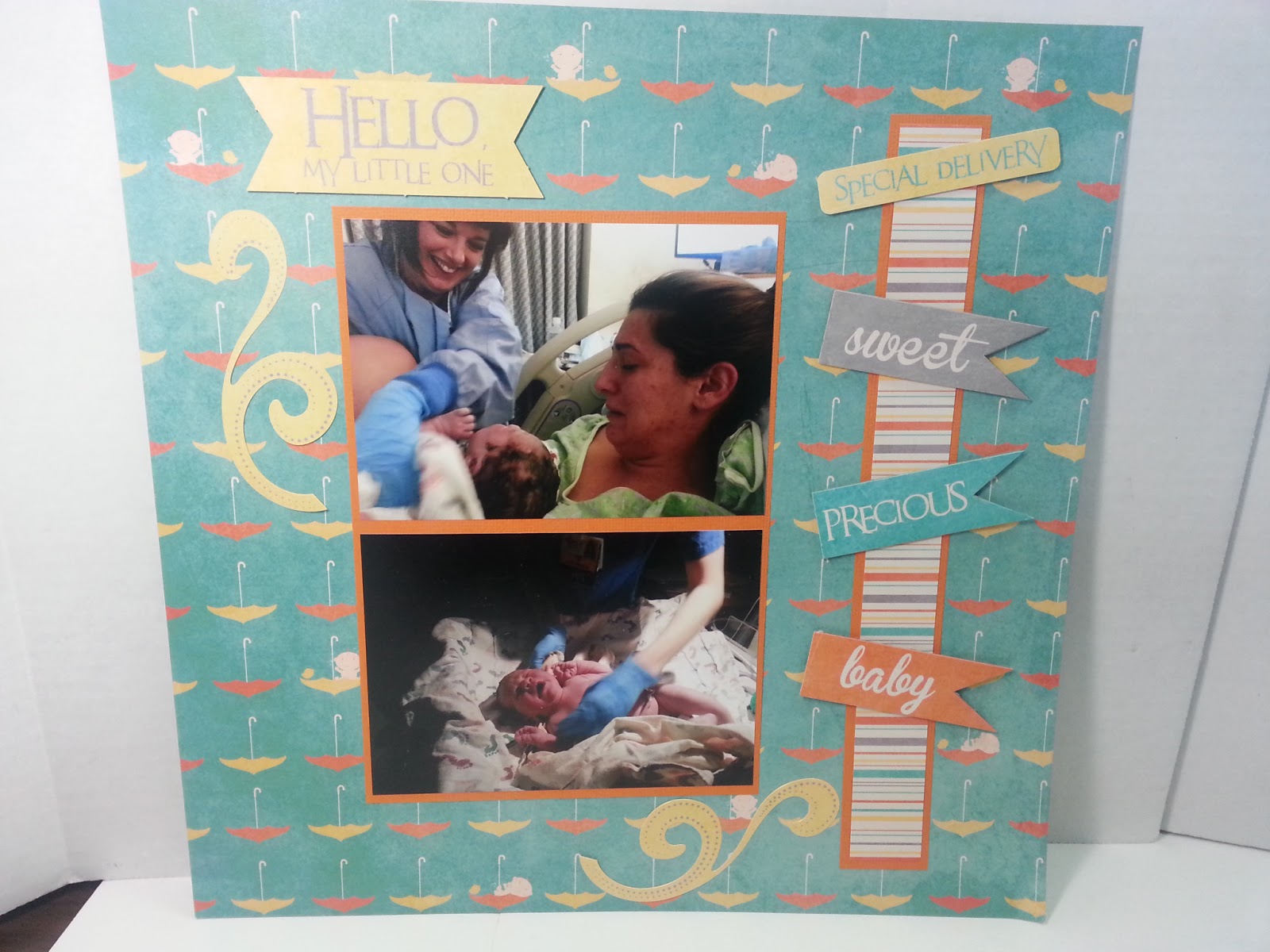
Hello My Little One

I'm sharing my first two page layout for Kashton. I am so thankful that I work at my LSS Cat's Creations. I'm asked to make pages with new paper to display at the store for examples of what to do! This helps me continue to make progress! For this layout I got my inspiration from CatNanDo Sketch #1 of 2013. This is a two page sketch. Which I love as I typically do a two page layout.
 This is the left side.
This is the right side.

 Here is left side of my layout. These are pictures of the day Kashton was born. We couldn't have asked for a better nurse. It didn't hurt that we knew her as well! Vanessa is overcome with emotion at the first look at her son after birth! He was a much bigger baby than any of us imagined weighing 9lbs .28 oz. and 21 inches long!

As you can see I took some liberty with the sketch. But sketches are intended to inspire your creativity not just copy...although you can most certainly do that. For this layout I am highlighting Moxie's new paper collection called "Wee Ones". This paper was unveiled at the Cat's February Retreat. I used a diecut from that collection for the title and word stickers on the vertical striped paper.
Here is the right side of my layout. Keannon and Vanessa admiring their new son. I apologize that the middle photo is so dark. I think I'll go have that edited and reprint. And Kennedy meeting her brother for the first time. She was quite excited to get to meet him!

I didn't embellish much on this page. I did use some clear stamps I had purchased from my LSS to put the stats for Kashton. I cut out the cream oval and the scalloped orange paper using Spellbinders dies. I inked the oval with Tim Holtz distress Antique Linen. I wanted to journal about this day so I made a pocket to go behind the oval, sewed to the background paper. I made a tag for journaling using my Tim Holtz die. I inked it with my blending tool using Antique Linen then tied twine to the tag.

Here is how the two pages look together.
Remember to see the pictures larger just click on the photo. Two down and many more to go! At least I've started now!

Kashton is starting to smile now. Vanessa took this photo today.
Have a good one!